UX of Definition
VelaUX uses the UI-Schema specification to customize UI elements of components, workflow steps, and operation and maintenance feature resources, in the case of variable input parameters, to achieve a more native UI experience.
At present, the UI-Schema specification mainly acts on the data input side and will be extended to the data visualization side in the future.
How UI-Schema works
The components, workflow steps, and operation and maintenance feature types with different UI-Schema working principles are defined through CUE, which we call XDefinition, and almost every definition includes the definition of input parameters. for example:
scaler: {
    type: "trait"
    annotations: {}
    labels: {}
    description: "Manually scale K8s pod for your workload which follows the pod spec in path 'spec.template'."
    attributes: {
        podDisruptive: false
        appliesToWorkloads: ["*"]
    }
}
template: {
    parameter: {
        // +usage=Specify the number of workload
        replicas: *1 | int
    }
    // +patchStrategy=retainKeys
    patch: spec: replicas: parameter.replicas
}
In the above example, the user input parameter is replicas.
In the UI we want the user to be able to set the number of replicas via a number input form.
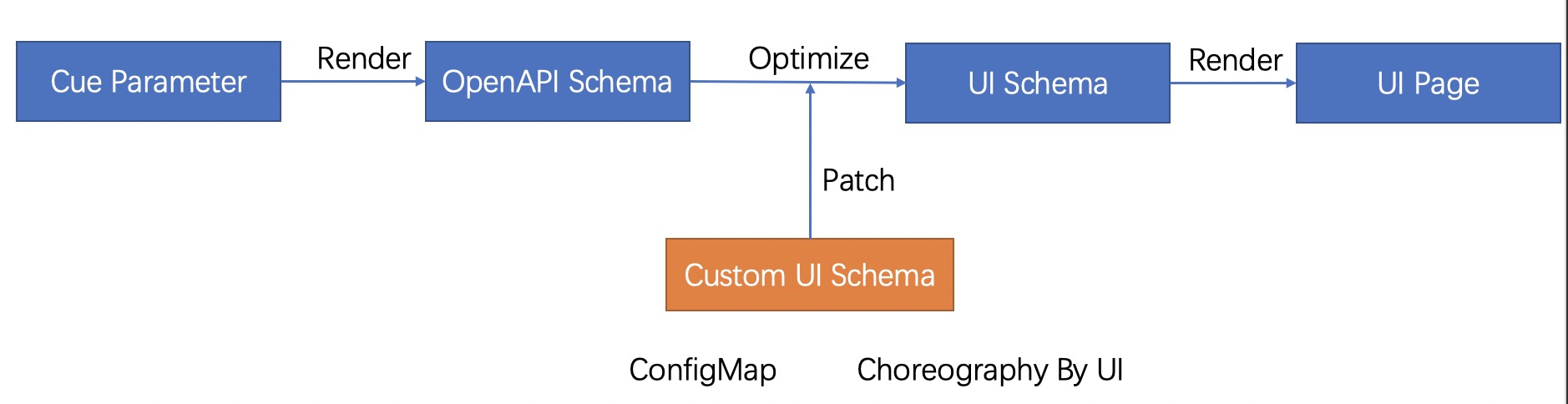
Its workflow is in the figure above. The API Schema is generated through the defined CUE, and then the default UI Schema is generated through the API Schema. If there is a custom UI Schema, the default configuration is patched with the custom configuration. The UI renders the front-end page based on the final UI Schema.
The spec are as follows:
- jsonKey: string         The field name
  label: string           The show name in UI
  description: string     The help info in UI
  uiType: string          The react component type in UI
  sort: int               The sort number
  disabled: bool          Disable this field.
  style:
    colSpan: int          Defines the number of grids for the form, with 24 representing 100% width.
  conditions:             Control whether fields are enabled or disabled by certain conditions.
    - jsonKey: string     Specifies the path of the field, support the peer and subordinate fields.
      op: == | != | in
      value: any          Specifies the expected value.
      action: enable|disable
  validate:               The value validate rule, It must be defined as a whole.
    defaultValue: any     The default values.
    required: bool
    max: int              The max value for number.
    min: int              The min value for number.
    maxLength: int        The max length for string.
    minLength: int        The min length for string.
    pattern: string
    options:              Optional, for select forms
    - label: string
      value: string
    immutable: bool       Set the immutable is true, indicates that the parameter cannot be changed.
  subParameters:
    - jsonKey: string
      ...
Supported react component types
Basic form
- Input
- Number
- Select
- Switch
- Radio
- Password
Business form
- Ignore: There are subordinate fields, and the current field is not displayed.
- SecretSelect: Load the secret list to assist user selection
- SecretKeySelect: Load the secret key list by the secret name of the user selected to assist user selection
- CPUNumber: CPU-style number input form.
- MemoryNumber: Memory-style number input form.
- DiskNumber: Disk-style number input form.
- K8sObjectsCode: The YAML input form of Kubernetes resource.
- HelmRepoSelect: Load the helm repositories from integration configs to assist user selection.
- HelmChartSelect: Load the helm charts to assist user selection.
- HelmChartVersionSelect: Load the versions of the selected helm chart to assist user selection.
- HelmValues: Load the default values of the selected helm chart and version to assist the user to configure the custom values.
- PolicySelect: Load the policies of the current application to assist user selection.
- ImageInput: Load and show the image info by users input image name.
- CertBase64: Support users upload or input the string, automatically base64 encoded. Suitable the fields such as the certificates and keys. (Added in 1.5+)
Combination form
- KV
- Strings
- Structs
- Group: render as a titled container
Example
Ref:https://github.com/kubevela/catalog/tree/master/addons/velaux/schemas
How to expand
UI-Schema mainly extends front-end react components, refer to https://github.com/kubevela/velaux/tree/main/src/extends